Statistics - Topic 11: Mathematics Study Notes Form Two
Welcome to our website darasahuru.ac.tz, in this post you will get Topic 11: Statistics - Mathematics Study Notes Form Two, Form Two Mathematics Notes, Education Materials form two notes, Read and download PDF Notes On STATISTIS, Mathematics Study Notes For Form Two.
Statistics
Statistics is the study of the collection, analysis, interpretation, presentation and organization of data.
Statistics helps to present information using picture or illustration. Illustration may be in the form of tables, diagrams, charts or graphs.
Pictograms
Display Information by pictograms
For example here is a pictograph showing how many apples were sold over 4 months at a local shop.
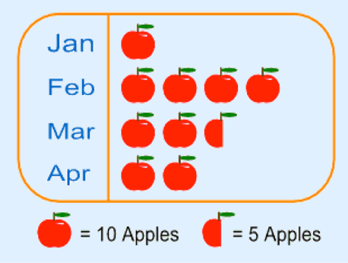
Note that:
The method is not very accurate. For example in our example we can’t show just 1 apple or 2 apples.
Pictures should be of the same size and same distance apart. This helps easy comparison.
The scale depends on the amount of data you have. If the data is huge, then one image can stand for large number like 100, 1000, 10 000 and so on.
Bar Charts
They are also called bar graphs. Is a graphical display of information using bars of different heights.
Horizontal and Vertical Bar Charts
Draw horizontal and vertical bar charts
For example; imagine you just did a survey of your friends to find what kind of movie they liked best.
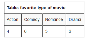
We can show that on a bar graph as here below:
Horizontal scale: 1 cm represents 1 movie they watched.

Interpretation of Bar Chat
Interpret bar chart
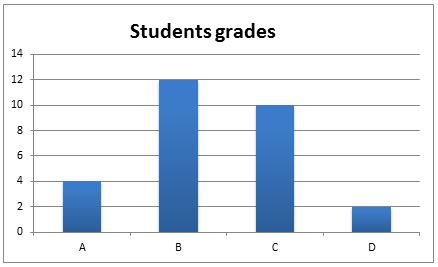
in a recent math test students got the following grades:

And this is a bar chart.
Horizontal scale: 1 cm represents 2 students
These are graphs showing information that is connected in some way. For example change over time.
Example 1
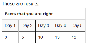
you are learning facts about mathematics and each day you do test to see how Good you are.
Solution
We need to have a scale that helps us to know how many Centimeter will represent how many facts that you were correct.
Vertical scale: 1 cm represents 2 facts that you were right
Horizontal scale: 2 cm represents 1 day.

Interpretation of Line Graphs
Interpret line graphs
Example 2
The graph below shows the temperature over the year:
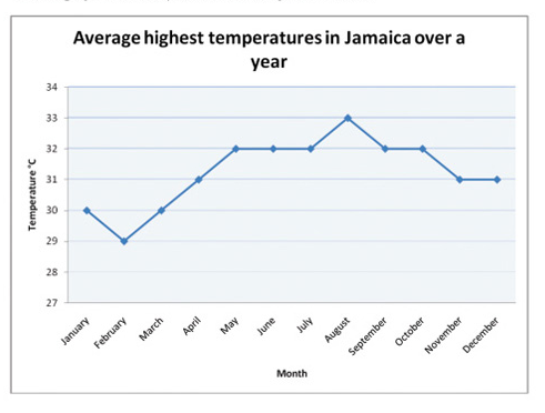
- The month that had the highest temperature was August.
- The month with the lowest temperature was February.
- The difference in temperature between February and may is (320-290)=30C.
- The total number of months that had temperature more than 300C was 9.
Pie Chart
This is a special chart that uses “pie slices” to show relative size of data. It is also called Circle graph.
Example 3
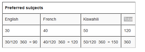
Step 1: put all you are data into a table and then add up to get a total.

Step 2: divide each value by the total and then multiply by 360 degrees to figure out how many degrees for each “pie slice” (we call pie slice a sector) We multiply by 360 degrees because a full circle has a total of 360 degrees.

Interpretation of Pie Charts
Interpret pie charts
Example 4
Interpreting the pie charts.
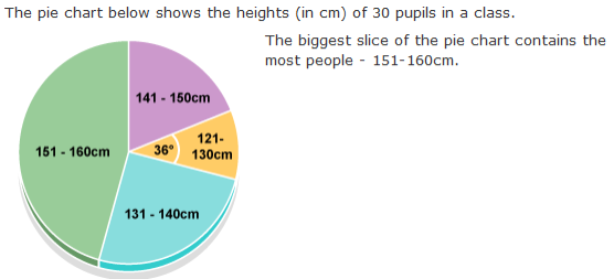
How many pupils are between 121-130cm tall?
36/360 x 30 = 3
Frequency Distribution Tables
By counting frequencies we can make Frequency Distribution table.
Frequency Distribution Tables from Raw Data
Make frequency distribution tables from raw data
•Write how often a certain number occurs. This is called tallying
- how often 1 occurs? (2 times)
- how often 2 occurs? (5 times)
- how often 3 occurs? (4 times)
- how often 4 occurs? (2 times)
- how often 5 occurs? (1 times)
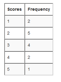
From the table we can see how many goals happen often, and how many goals they scored once and so on.
Interpretation of Frequency Distribution Table form Raw Data
Interpret frequency distribution table form raw data
Grouped Distribution Table
Step 1: Put the numbers in order. 1, 1, 1, 4, 4, 5, 5, 5, 6, 7, 8, 8, 8, 9, 9, 9, 9, 9, 9, 10, 10, 11, 12, 12, 13, 14, 14, 15, 15, 16, 16, 16, 16, 17, 17, 17, 18, 18,
Step 2: Find the smallest and the largest values in your data and calculate the range.
Let us say we want 5 groups. Divide the range by 5 i.e. 17/5 = 3.4. then round up to 4

The largest group goes up to 19 which is greater than the maximum value. This is good.
Step 6: Tally to find the frequencies in each group and then do a total as well.
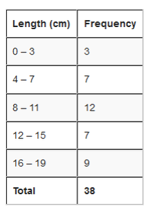
See an illustration below to differentiate between Real limits and limits.
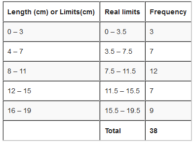
Class size is the difference between the upper real limit and lower real limit i.e. class size = upper real limit – lower real limit
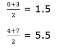
Class mark =

Interpretation of Frequency Distribution Tables
Interpret frequency distribution tables
Example 5
interpretation of frequency distribution data:
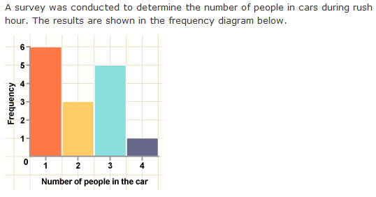
total number of cars in the survey:
Frequency Polygons
This is a graph made by joining the middle-top points of the columns of a frequency Histogram
Drawing Frequency Polygons from Frequency Distribution Tables
For example; use the frequency distribution table below to draw a frequency polygon.
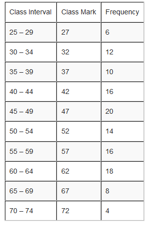
Solution
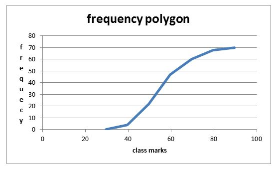
Interpretation of Frequency Polygons
Interpret frequency polygons
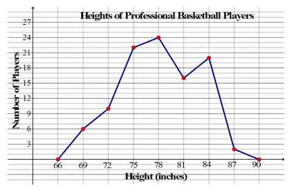
Histograms
Is a graphical display of data using bars of different heights. It is similar to bar charts, but a Histogram groups numbers into ranges (intervals). And you decide what range to use.

Represent the information above using a histogram.
In order to draw histogram we need to calculate class marks. We will use class marks against frequencies.
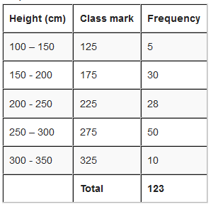
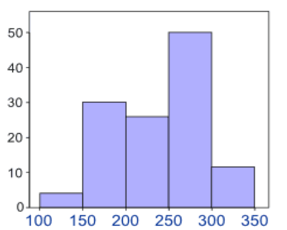
Interpretation of Histograms
Interpret histograms
The histogram below represents scores achieved by 250 job applicants on a personality profile.
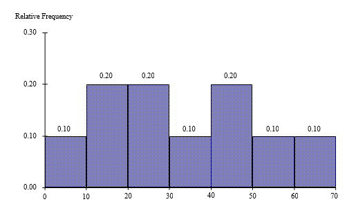
- Percentage of the job applicants scored between 30 and 40 is10%
- Percentage of the job applicants scored below 60 is90%
- Job applicants scored between 10 and 30 is100
Cumulatve Frequency Curves
Cumulative means “how much so far”. To get cumulative totals just add up as you go.
For example; Hamis has earned this much in the last 6 months.
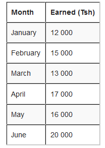
How to get cumulative frequency?
But, for February, the total earned so far is Tsh 12 000 + Tsh 15 000 = Tsh 27 000.
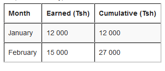
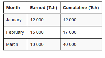
The rest of the months will be:
The results on a cumulative frequency table will be as here below:

The last cumulative total should math the total of all earnings.
Note: To draw an Orgive, plot the points vertically above the upper real limits of each interval and then join the points by a smooth curve. Add real limit to the lowest real limit and give it zero frequency.
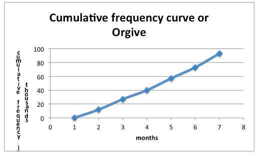
Interpret a cumulative frequency curve
Interpretation:
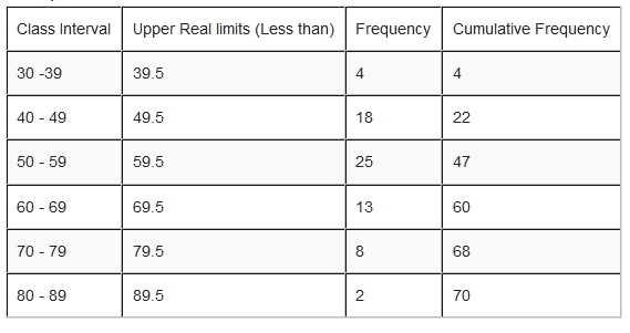
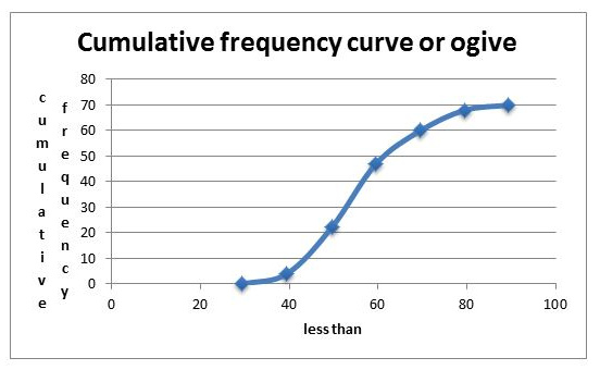
2. The following table represent the number of pupils with their corresponding height.


