Topic 11: Statistics - Mathematics Study Notes Form Two

Topic 11: Statistics – Mathematics Study Notes Form Two

Basic Mathematics For Form Four Full Notes, LINEAR PROGRAMMING. Linear programming – is a branch of mathematics which deals with either minimizing the cost or maximizing the profit. It gives the best way of utilizing the scarce resources available. It is so called because it only involves equations and inequalities which are linear. Simultaneous Equation. One of the methods used in solving linear simultaneous equations is a graphical method. Two linear simultaneous equations in two unknowns can be graphically solved by passing through the following procedures. Draw the two lines which represent the two equations on the xy – plane this is done by deter mining at least two points through which each line passes, the intercept are commonly used Determine the point of intersection of the two lines. This point of intersection is the solution to the system of equations. FACT: If two straight lines are not parallel then they meet at only one point: In case the lines do not meet, there is no solution to the corresponding system of simultaneous equations. Example 1 Graphically solve the following system of simultaneous equations. Example 2 Find the solution to the following system of simultaneous equations by graphical method. Solving Simultaneous Equations Graphically Solve simultaneous equations graphically Example 3 Solve the following simultaneous equations graphically and check your solution by a non-graphical method: Example 4 Find the solution to the following system of simultaneous equations by graphical method. Exercise 1 Find the solution to the following systems of simultaneous equations graphically. Try: Ali paid 34 shillings for 10 oranges and 35 mangoes. Moshi went to the same market and paid 24 shillings for 16 oranges and 18 mangoes. What was the price for a mango and for an orange? Inequalities Forming Linear Inequalities in Two Unknowns from Word Problems Form linear inequalities in two unknowns from word problems Linear inequalities Normally any straight line drawn on xy – plane separates it into two disjoint sets. These sets are called half – planes Consider the equation y = 5 drawn on the xy plane as shown below. From the figure above, all points above the line, that is all points in the half plane A which is above the line satisfy the relation y>5 and those lying in the half plane B which is below the given line, satisfy the relation y< 5. Shading of Regions In linear programming usually the region of interest is left clear that is we shade unwanted region(s). NB: When shading the half planes we consider the inequalities as the equations but dotted lines are used for the relations with > or < signs and normal lines are used for those with ≥ or ≤ signs. Consider the inequalities x>0, y>0 and 2x + 3y >12 represented on the xy-plane In this case we draw the line x=0, y= 0 and 2x+3y=12 but the point about the inequality signs for each equation must be considered. From the figure above, the clear region satisfy all the inequalitiesx>0, y>0 and 2x + 3y >12, these three lines are the boundaries of the region. The Solution Set of Simultaneous Linear Inequalities Graphically Find the solution set of simultaneous linear inequalities graphically Example 5 Draw and show the half plane represented by 8x + 2y ≥16 Feasible Region Definition: In the xy plane the region that satisfies all the given inequalities is called the feasible region (F.R) Example 6 Indicate the feasible region for the inequalities 2x+3y ≥ 12 and y-x ≤ 2. Determine the solution set of the simultaneous inequalities y + x ≥3 and x-2y ≤ 9. Example 7 Fatuma was given 30 shillings to buy oranges and mangoes. An orange costs 2 shillings while a mango costs 3 shillings. If the number of oranges bought is at least twice the number of mangoes, show graphically the feasible region representing the number of ranges and mangoes she bought, assuming that no fraction of oranges and mangoes are sold at the market. Solution:- Let x be the number of oranges she bought and y the number of mangoes she bought. Now the cost of x and y together is 2x + 3y shillings which must not exceed 30 shillings. Inequalities: 2x + 3y ≤30 ……… (i) and x≥2y …………….. (ii), Also because there is no negative oranges or mangoes that can be bought, then x≥ and y≥0 ……….. (iii) Now the line 2x + 3y ≤30 is the line passing through (0, 10) and (15,0) and the line x≥2y or x – 2y ≥ 0 is the line which passes through (0,0) and (2,1). Exercise 2 For practice. Draw the graph of the equation 2x – y = 7 and show which half plane is represented by 2x – y >7 and the one represented by 2x – y 3 – x on the same axes and indicate the feasible region. A post office has to transport 870 parcels using a lorry, The Objective Function An Objective Function from Word Problems Form an objective function from word problems Linear programming components Any linear programming problem has the following: Objective Alternative course (s) of action which will achieve the objective. The available resources which are in limited supply. The objective and its limitations should be able to be expressed as either linear mathematical equations or linear inequalities. Therefore linear programming aims at finding the best use of the available resources. Programmingis the use of mathematical techniques in order to get the best possible solution to the problem Steps to be followed in solving linear programming problems; Read carefully the problem, if possible do it several times. Use the variables like x and y to represent the resources of interest. Summarize the problem by putting it in mathematical form using the variables let in step (b) above. In this step you need to formulate the objective function and inequalities or constraints. Plot the constraints on a graph From your graph, identify the corner points. Use the objective function to test each corner point to find out which one gives the optimum solution. Make conclusion after finding or identifying the optimum point among the corner points. Maximum and Minimum Values Corner Points on the Feasible Region Locate corner points on the feasible region Example 8 A student has 1200 shillings to spend on exercise books. At the school shop an exercise book costs 80shillings, and at a stationery store it costs 120 shillings. The school shop has only 6 exercise books left and the student wants to obtain the greatest number of exercise books possible using the money he has. How many exercise books will the student buy from each site? Therefore the student will buy 6 exercise books from each site. Example 9 A nutritionist prescribes a special diet for patients containing the following number of Units of vitamins A and B per kg, of two types of food f1 and f2 If the daily minimum in take required is 120 Units of A and 70 units of B, what is the least total mass of food a patient must have so as to have enough of these vitamins? Solution: Let x be the number of kg(s) of F1 that patient gets daily and y be the number of kg(s) of F2 to be taken by the patient daily. Objective function: F (x, y) = (x + y) minimum f (C) = 10 + 0 = 10 So f (B) = 6.8 is the minimum Therefore the least total mass of food the patient must have is 6.8 kilograms The Minimum and Maximum Values using the Objective Functio Find the minimum and maximum values using the objective function Example 10 A farmer wants to plant coffee and potatoes. Coffee needs 3 men per hectare while potatoes need also 3 men per hectare. He has 48 hired laborers available. To maintain a hectare of coffee he needs 250 shillings while a hectare of potatoes costs him 100 shillings. . Find the greatest possible land he can sow if he is prepared to use 25,000 shillings. Solution: Let x be the number of hectares of coffee to be planted and y be the number of hectares of potatoes to be planted. Objective function: f (x, y) = (x, + y) maximum 3x + 3y ≤ 48 or x + y ≤16 ………….(i) 250x + 100y≤ 25,000 Or 5x + 2y ≤ 500………(ii) x ≥ 0 ……………………(iii) y≥ 0 ……………………(iv) Using the objective function f (x, y) = (x + y) maximum, f (A) = (0 + 250) = 250 f (B) = (0+16) = 16 f (C) = (16+0) = 16 f(D) = (100+0)= 100 (maximum) Therefore the greatest possible area to be planted is 250 hectors of potatoes. NB: In most cases L.P problems must involve non-negativity constraints (inequalities) that are x ≥ 0 and y ≥ 0. This is due to the fact that in daily practice there is no use of negative quantities. Example 11 A technical school is planning to buy two types of machines. A lather machine needs 3m2 of floor space and a drill machine needs 2m2 of floor space. The total space available is 30m2. The cost of one lather machine is 25,000 shillings and that of drill machine is 30,000 shillings. The school can spend not more than 300,000 shillings, what is the greatest number of machines the school can buy? Solution: Let x be the number of Lather machines and y be the number of drill machines to be bought Objective function: f(x, y) = (x + y) max Inequalities: 3x + 2y ≤ 30.. ………………….(i) 25,000x + 30,000y ≤300,000 Or 5x + 6y ≤ 60……………………..(ii) x ≥ 0 ……………………………….(iii) y ≥ 0…………………… ………….(iv) Since the incomplete machine can’t work, then B = (8, 3) or (7, 4).That is approximating values of x and y to the possible integers without affecting the given inequalities or conditions. Now by using the objective function, f (A) = 0 + 10 = 10 f(B) = 7 + 4 0r f (B) = 8 + 3 = 11 f (C) = 10 + 0 = 10 f (D) = 0 + ) = 0 So f (B) gives the maximum number of machines which is 11. Therefore the greatest number of machines that can be bought by the school is 11 machines. Exercise 3 1. Show on a graph the feasible region for which the restrictions are: y ≤ 2x, x≥ 6, y≥2 and 2x + 3y ≤30 From the graph at which point does: y – x take a maximum value? x + y take a maximum value? y – x take a maximum value? 2. With only 20,000 shillings to spend on fish, John had the choice of buying two types of fish. The price of a single fish type 1 was 2,500shillings and each fish of type 2 was sold at 2,000 shillings. He wanted to buy at least four of type 1. What is the greatest number of fish did John buy? How many of each type could he buy? 3. How many corner points does the feasible region restricted by the inequalities? x≥0, y ≥ 0, 3x + 2y ≤ 18 and 2x + 4y ≤16 have? Which corner point maximizes the objective function f (x, y) = 2x + 5y?, Matrices and Transformation, Topic 6: Vectors - Basic Mathematics Form Four, Trigonometry, Probability, Three Dimensional Figures, Area and Perimeter, Coordinate Geometry, Statistics, Similarity

Topic 11: Statistics – Mathematics Study Notes Form Two

Welcome to our website darasahuru.ac.tz, in this post you will get Topic 11: Statistics – Mathematics Study Notes Form Two, Form Two Mathematics Notes, Education Materials form two notes, Read and download PDF Notes On STATISTIS, Mathematics Study Notes For Form Two.

Statistics

Statistics is the study of the collection, analysis, interpretation, presentation and organization of data.

Statistics helps to present information using picture or illustration. Illustration may be in the form of tables, diagrams, charts or graphs.

Statistics helps to present information using picture or illustration.
 
Illustration may be in the form of tables, diagrams, charts or graphs.

Pictograms

Information by Pictograms
 

Display Information by pictograms

This is a way of showing information using images. Each image stands for a certain number of things.
 
Interpretation of Pictograms
 
Interpret pictograms
 

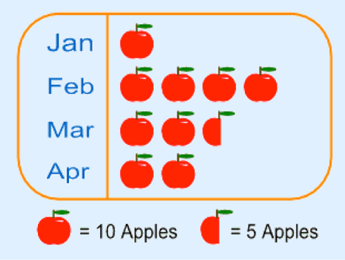
For example here is a pictograph showing how many apples were sold over 4 months at a local shop.

1 1441178664201
 
Each picture of 1 apple means 10 apples and the half-apple means 5 apples.
 

Note that:

The method is not very accurate. For example in our example we can’t show just 1 apple or 2 apples.

Pictures should be of the same size and same distance apart. This helps easy comparison.

The scale depends on the amount of data you have. If the data is huge, then one image can stand for large number like 100, 1000, 10 000 and so on.

Bar Charts

They are also called bar graphs. Is a graphical display of information using bars of different heights.

Horizontal and Vertical Bar Charts

Draw horizontal and vertical bar charts

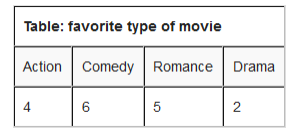
For example; imagine you just did a survey of your friends to find what kind of movie they liked best.

2 1441181016142
 

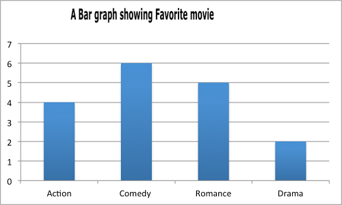
We can show that on a bar graph as here below:

Scale: vertical scale: 1cm represents 1 kind of movie
 

Horizontal scale: 1 cm represents 1 movie they watched.

3 1441181216681
 

Interpretation of Bar Chat

Interpret bar chart

in a recent math test students got the following grades:

4 1441181432949
 

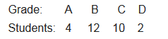
And this is a bar chart.

Scale: vertical scale: 1 cm represents 1 grade
 

Horizontal scale: 1 cm represents 2 students

5 1441181634928
 
Line Graphs

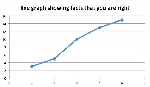
These are graphs showing information that is connected in some way. For example change over time.

Representing Data using Line Graphs
 
Represent data using line graphs
 

Example 1

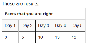
you are learning facts about mathematics and each day you do test to see how Good you are.

6 1441181839330
 

Solution

We need to have a scale that helps us to know how many Centimeter will represent how many facts that you were correct.

Vertical scale: 1 cm represents 2 facts that you were right

Horizontal scale: 2 cm represents 1 day.

7 1441182064769
 

Interpretation of Line Graphs

Interpret line graphs

Example 2

The graph below shows the temperature over the year:

8 1441183445905
 
From the graph we can get the following data:
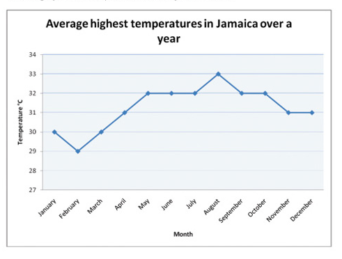
  • The month that had the highest temperature was August.
  • The month with the lowest temperature was February.
  • The difference in temperature between February and may is (320-290)=30C.
  • The total number of months that had temperature more than 300C was 9.

Pie Chart

This is a special chart that uses “pie slices” to show relative size of data. It is also called Circle graph.
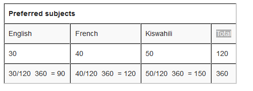
Data using Pie Charts
 
Display data using pie charts
 

Example 3

The survey about pupils interests in subjects is as follows: 30 pupils prefer English, 40 pupils refer French and 50 pupils prefer Kiswahili. Show this information in a pie chart.

How to make them?
 

Step 1: put all you are data into a table and then add up to get a total.

9 1441184478090
 

Step 2: divide each value by the total and then multiply by 360 degrees to figure out how many degrees for each “pie slice” (we call pie slice a sector) We multiply by 360 degrees because a full circle has a total of 360 degrees.

10 1441184818332
 
Step 3: draw a circle of a size that will be enough to show all information required. Use a protractor to measure degrees of each sector. It will look like the one here below:
 
11 1441184907839
 

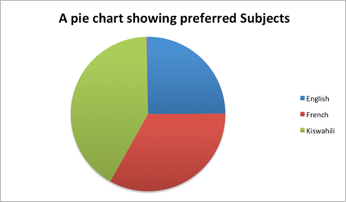
Interpretation of Pie Charts

Interpret pie charts

Example 4

Interpreting the pie charts.

12 1441185123316
 

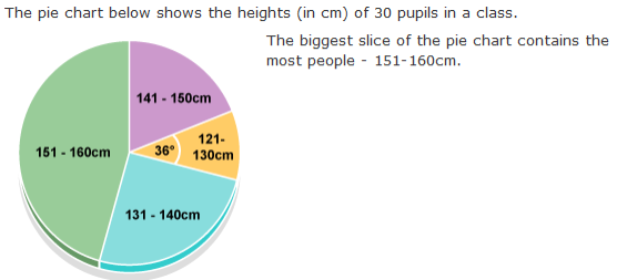
How many pupils are between 121-130cm tall?

The angle of this section is 36 degrees. The question says there are 30 pupils in the class. So the number of pupils of height 121 – 130 cm is:
 

36/360 x 30 = 3

Frequency Distribution Tables

Frequency is how often something occurs. For example; Amina plays netball twice on Monday, once on Tuesday and thrice on Wednesday. Twice, once and thrice are frequencies.
 

By counting frequencies we can make Frequency Distribution table.

Frequency Distribution Tables from Raw Data

Make frequency distribution tables from raw data

For example; Sam’s team has scored the following goals in recent games.
 
2, 3, 1, 2, 1, 3, 2, 3, 4, 5, 4, 2, 2, 3.
 
How to make a frequency distribution table?
 
•Put the number in order i.e. 1, 1, 2, 2, 2, 2, 2, 3, 3, 3, 3, 4, 4, 5
 

•Write how often a certain number occurs. This is called tallying

  1. how often 1 occurs? (2 times)
  2. how often 2 occurs? (5 times)
  3. how often 3 occurs? (4 times)
  4. how often 4 occurs? (2 times)
  5. how often 5 occurs? (1 times)
 
•Then, wrote them down on a table as a Frequency distribution table.
 
13 1441186297427
 

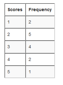
From the table we can see how many goals happen often, and how many goals they scored once and so on.

Interpretation of Frequency Distribution Table form Raw Data

Interpret frequency distribution table form raw data

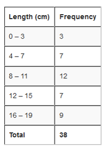
Grouped Distribution Table

This is very useful when the scores have many different values. For example;
Alex measured the lengths of leaves on the Oak tree (to the nearest cm)
9,16, 13, 7, 8, 4, 18, 10, 17, 18, 9, 12, 5, 9, 9, 16, 1, 8, 17, 1, 10,
5, 9, 11, 15, 6, 14, 9, 1, 12, 5, 16, 4, 16, 8, 15, 14, 17.
How to make a grouped distribution table?
 

Step 1: Put the numbers in order. 1, 1, 1, 4, 4, 5, 5, 5, 6, 7, 8, 8, 8, 9, 9, 9, 9, 9, 9, 10, 10, 11, 12, 12, 13, 14, 14, 15, 15, 16, 16, 16, 16, 17, 17, 17, 18, 18,

Step 2: Find the smallest and the largest values in your data and calculate the range.

The smallest (minimum) value is 1 cm
 
The largest (maximum) value is 18 cm
 
The range is 18 cm – 1 cm = 17 cm
Step 3:
Find the size of each group. Calculate an approximate size of the group by dividing the range by how many groups you would like. then, round that group size up to some simple value like 4 instead of 4.25 and so on.

Let us say we want 5 groups. Divide the range by 5 i.e. 17/5 = 3.4. then round up to 4

Step 4: Pick a Starting value that is less than or equal to the smallest value. Try to make it a multiple of a group size if you can. In our case a start value of 0 make the most sense.
 
Step 5: Calculate the list of groups (we must go up to or past the largest value).
 
In our case, starting at 0 and with a group size of 4 we get 0, 4, 8, 12, 16. Write down the groups. Include the end value of each group. (must be less than the next group):
15 1441188766966
 

The largest group goes up to 19 which is greater than the maximum value. This is good.

Step 6: Tally to find the frequencies in each group and then do a total as well.

16 1441188903250
 
Done!
 
Upper and Lower values
Referring our example; even though Alex measured in whole numbers, the data is continuous.
For instance 3 cm means the actual value could have been any were between 2.5 cm to 3.5 cm. Alex just rounded numbers to whole numbers.
And 0 means the actual value have been any where between -0.5 cm to 0.5 cm. but we can’t say length is negative. 3.5 cm is called upper real limit or upper boundary while –0.5 cm is called lower real limit or lower boundary. But since we don’t have negative length we will just use 0. So regarding our example the lower real limit is 0.
The limits that we used to group the data are called limits. For example; in a group of 0 – 3, is called lower limit and is called upper limit.
 

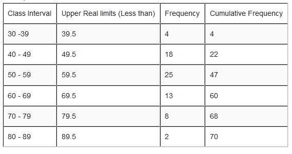
See an illustration below to differentiate between Real limits and limits.

19 1441189198472
 

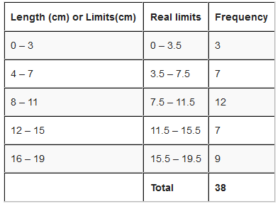
Class size is the difference between the upper real limit and lower real limit i.e. class size = upper real limit – lower real limit
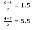
We use the symbol N (capital N) to represent the total number of frequencies.
Class Mark of a class Interval
 
This is a central (middle) value of a class interval. It is a value which is half way between the class limits. It is sometimes called mid-point of a class interval. Class mark is obtained by dividing the sum of the upper and lower class limits by 2. i.e.
 

Class mark =

20 1441189424956
 
Referring to our example class marks for the class intervals are;
 
21 1441197114926
 

Interpretation of Frequency Distribution Tables

Interpret frequency distribution tables

Example 5

interpretation of frequency distribution data:

14 1441187031439
 

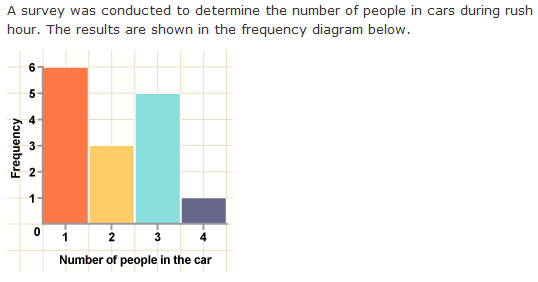
total number of cars in the survey:

6 + 3 + 5 + 1 = 15
 
There are 6 cars with one person in, 3 cars with two people, 5 cars with three people, and 1 car with four people.
 
the most likely number of people in a car:
Cars in the survey are most likely to have 1 person in them as this is the tallest bar – 6 of the cars in the survey had one occupant.

Frequency Polygons

This is a graph made by joining the middle-top points of the columns of a frequency Histogram

Drawing Frequency Polygons from Frequency Distribution Tables

Draw frequency polygons from frequency distribution tables
 

For example; use the frequency distribution table below to draw a frequency polygon.
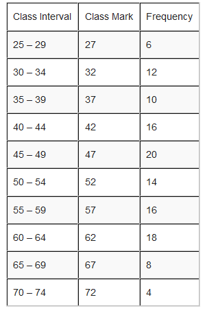
25 1441198104842
 

Solution

In a frequency polygon, one interval is added below the lowest interval and another interval is added above the highest interval and they are both assigned zero frequency. The points showing the frequency of each class mark are placed directly over the class marks of each class interval. The points are then joined with straight lines.
26 1441198259103
 

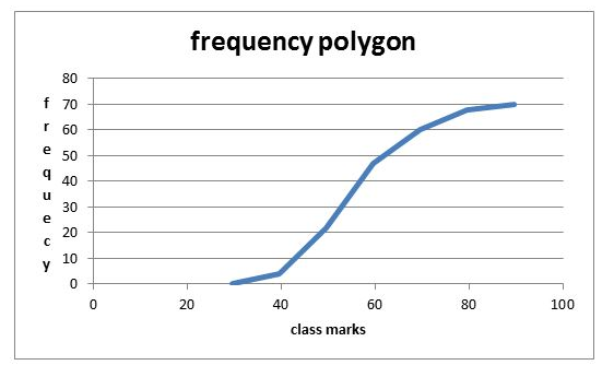
Interpretation of Frequency Polygons

Interpret frequency polygons
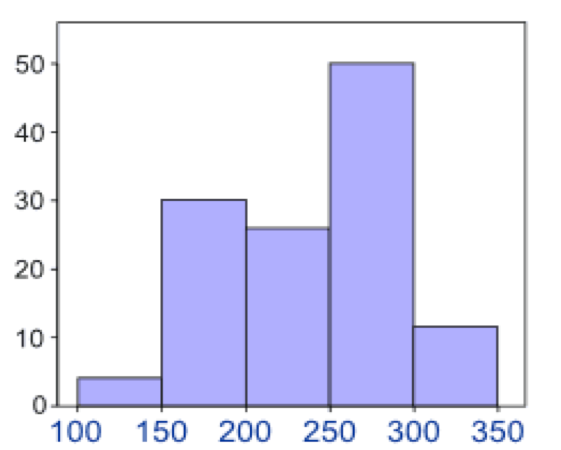
The frequency polygon below represents the heights, in inches, of a group of professional basketball players. Use the frequency polygon to answer the following questions:
 
40 1441203618442
 

Histograms

Is a graphical display of data using bars of different heights. It is similar to bar charts, but a Histogram groups numbers into ranges (intervals). And you decide what range to use.

Drawing Histograms from Frequency Distribution Table
 
Draw histograms from frequency distribution table
 
For example; you measure the height of every tree in the orchard in Centimeters (cm) and notice that, their height vary from 100 cm to 340 cm. And you decide to put the data into groups of 50 cm. the results were like here below:
22 1441197296105
 

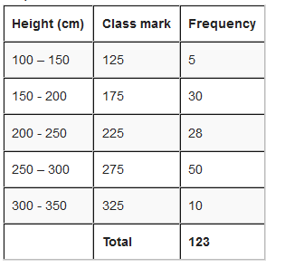
Represent the information above using a histogram.

Solution
 

In order to draw histogram we need to calculate class marks. We will use class marks against frequencies.

23 1441197435775
 
Scale: vertical scale: 1 cm represents 5 trees horizontal scale: 1 cm represents 50 cm (range of trees heigths).
24 1441197553797
 

Interpretation of Histograms

Interpret histograms

The histogram below represents scores achieved by 250 job applicants on a personality profile.

39 1441203026254
 
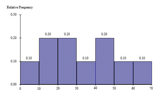
  1. Percentage of the job applicants scored between 30 and 40 is10%
  2. Percentage of the job applicants scored below 60 is90%
  3. Job applicants scored between 10 and 30 is100

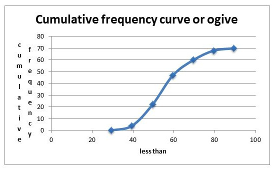
Cumulatve Frequency Curves

Cumulative means “how much so far”. To get cumulative totals just add up as you go.

Drawing Cumulative Frequency Curves from a Cumulative Frequency Distribution Table
Draw cumulative frequency curves from a cumulative frequency distribution table

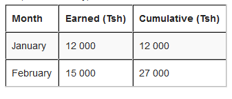
For example; Hamis has earned this much in the last 6 months.

27 1441198752619
 

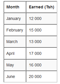
How to get cumulative frequency?

The first line is easy, the total earned so far is the same as Hamis earned that month.
 

But, for February, the total earned so far is Tsh 12 000 + Tsh 15 000 = Tsh 27 000.

29 1441198975168
for March, we continue to add up. The total earned so far is Tsh 12 000 + Tsh 15 000 + Tsh 13 000 = 40 000 or simply take the cumulative of February add that of March i.e. Tsh 27 000 + Tsh 13 000 = Tsh 40 000.
 
30 1441199081984
 

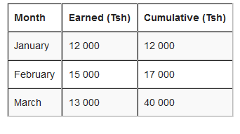
The rest of the months will be:

April: Tsh 40 000 + Tsh 17 000 = Tsh 57 000
 
May: Tsh 57 000 + Tsh 16 000 = Tsh 73 000
 
June: TSh 73 000 + Tsh 20 000 = Tsh 93 000
 

The results on a cumulative frequency table will be as here below:

31 1441199377551
 

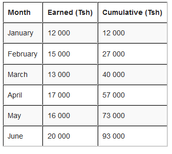
The last cumulative total should math the total of all earnings.

Graph for cumulative polygon is drawn with cumulative frequency on vertical axis and real upper limits on Horizontal axis.
 
Scale: Vertical scale: 1cm represents Tsh 20 000
 
Give number to months. i.e. January =2, February =3 and so on
 

Note: To draw an Orgive, plot the points vertically above the upper real limits of each interval and then join the points by a smooth curve. Add real limit to the lowest real limit and give it zero frequency.

32 1441200320122
 
Interpretation of a Cumulative Frequency Curve

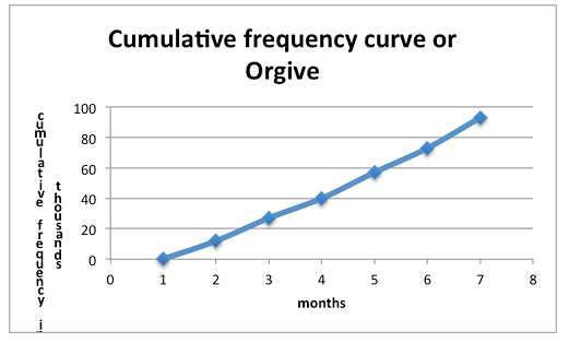
Interpret a cumulative frequency curve

Interpretation:

33 1441200489014
Its Cumulative Frequency Curve or Orgive will be:
34 1441200610601

Exercise 1

1. Represent the data in the table below using pictures (pictograms)
 
35 1441200812294

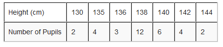
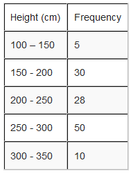
2. The following table represent the number of pupils with their corresponding height.

36 1441200950145

Leave a Comment

Darasa Huru: JOIN OUR WHATSAPP GROUP

You cannot copy content of this page. Contact Admin